Coachella
The idea is to immerse visitors in the festival by highlighting the in-person experience through use of natural elements and festival photography.
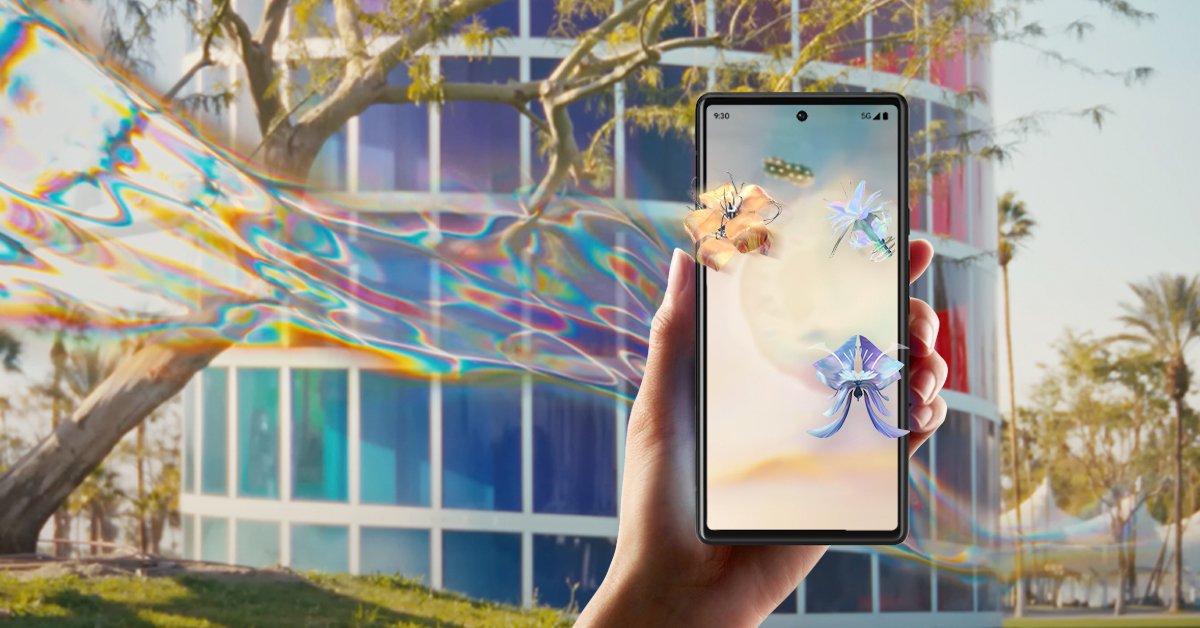
We also needed to create an interactive experience for Coachella’s Mirage. The Mirage allows its festival goers to reveal a more expansive Coachella where they will learn to interact and unlock new festival creativity on the fields and beyond.
Create a fresh, bold design that aligned on photography, color palettes, animation interactions, fonts and more.
Creating a vibrant design for one of the world's most renowned music festivals, while ensuring a seamless, intuitive user experience. This design needs to also be applied to multiple surfaces including video, social, and print, outside of the interactive experience
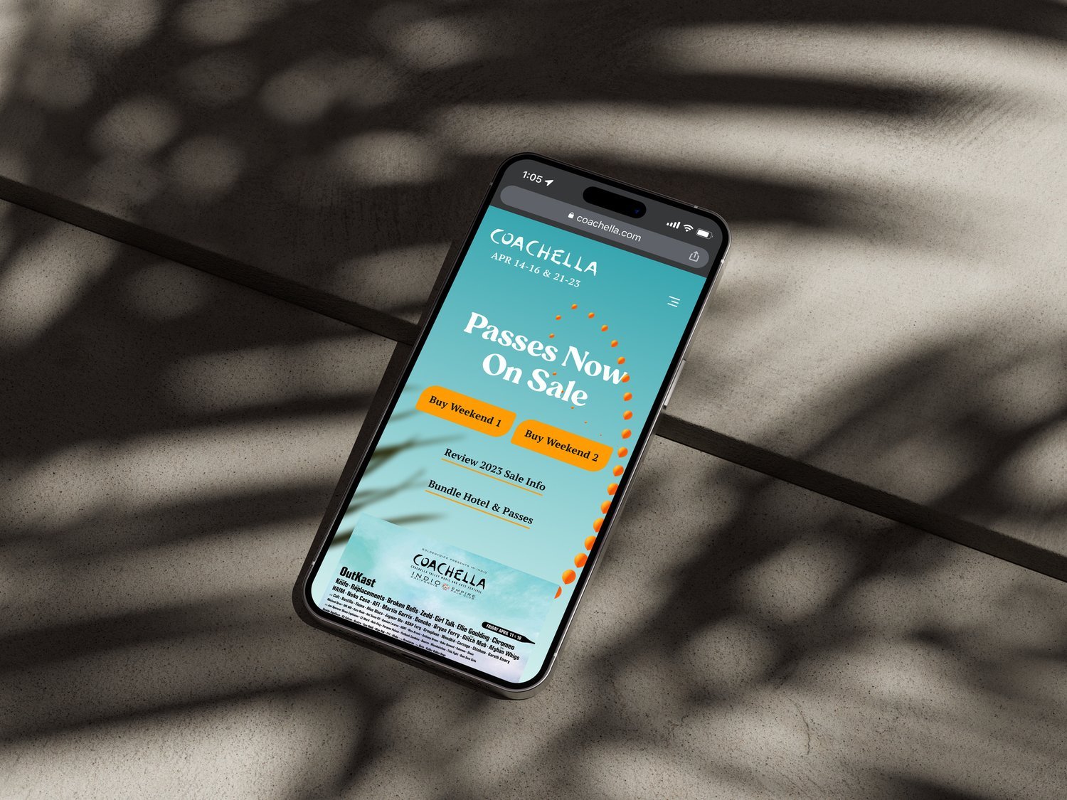
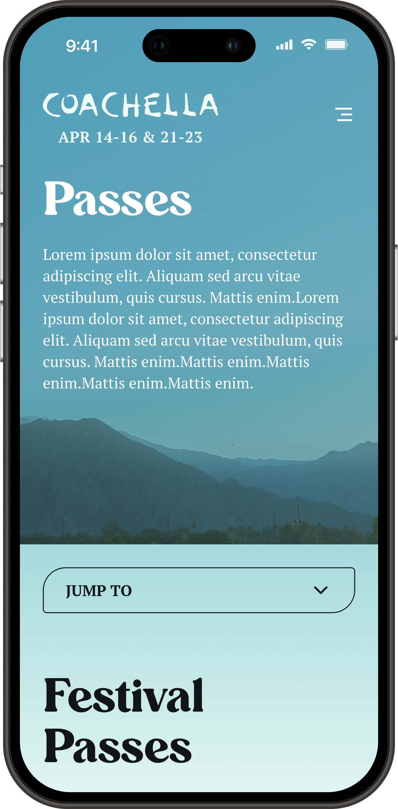
A captivating "sky-forward" design that accentuates the festival's vivid blue skies and lush green fields, adorned with cheerful balloons and radiating happiness.
Tools
Photoshop
Illustrator
After Effects
Lottie, Figma
Timeline
Overall: 14 weeks
Discovery & Research: 2 weeks
Design & Testing: 10 weeks
QA: 2 weeks
Insights
Coachella has multiple phases that were paramount to accounting for during its website lifecycle. Creating assets that occupied the website appropriately during each turnkey event were necessary to keep users informed.
April being when Coachella occurs, was the biggest month, but presale and initial sales of tickets were the other main events throughout the year. We needed to account for the content that would preside when the lineup wasn't announced and after the festival
Testing for IA through Maze
Tree Testing
Card Sorting
Comparative Analysis
Comparing Coachella's user experience to other competitors is paramount to staying on top of trends and design cues that can make the ticket buying experience more seamless. If there is a commonly understood means for displaying the lineup or a way to checkout with your tickets we need to make sure Goldenvoice has the best UX possible for those areas of focus.
Key Insights
More immersion
Leverage more real life photography from the festival
Feature some of the iconic scenary from Coachella
Dynamic
Push content with a featured section
Mobile first design experience for on-the-go
Highlight relevant information with a dynamic homepage hero
Self-Service
Build out the support section: Top 10 FAQs, Popular Scenarios (ex. 1st Time, Tickets, Planning Your Trip, Camping, Parents), etc.
Reorder the top level navigation to align with trends found in the site analytics
Address high-volume support topics with announcement banners on the homepage
Exploring Themes
Coachella is a pivotal cultural moment every year. We wanted to make sure that the designs remained grounded but pushed the limits of where design and creative were going into the year.
The moodboard for “Sky Forward” theme that we moved forward with
Branding Swatches
With each direction we explore "swatches" that took pieces of the look and feel of the brand and explored how it would expand outside of photography.
Making sure colors and font's worked cohesively together was the primary goal after showing the initial moodboards.
Site and UI Design
The whole site experience is meant to be a digital recreation of when a festival goer takes a moment during golden hour, lays down in the grass, and looks up at the sky. The UI itself takes cues from the festival. Each button is a reference to the balloons that float above the grounds. The text itself is smooth and flowing to represent clouds.
The Mirage
The Mirage, as part of the Coachella festival, serves as a conduit for festival attendees to delve into the realms of immersive technologies and experiences within the festival grounds. Augmented reality and web3 experiences artfully complement the performances of the artists. Our objective was to craft a dynamic site that actively engaged users, spotlighting aspects beyond mere ticket acquisition, and effectively channeling their focus towards the myriad of experiences available.
Day / Night Cycle
When visitors entered the Mirage, their local time was considered to create a unique brand experience. The colors and styles of the Mirage would adapt depending on whether it was morning, noon, or the magical golden hour.
Animations
Specialized 3D animations, complemented by Mirage color shifts and distortion effects, dynamically morphed the header upon user interaction. This transformation was triggered when users either tapped or utilized their mouse to navigate further into the page.
WYSIWYG
I devised a versatile WYSIWYG content creation toolkit. This ensured that when the team at Goldenvoice was required to create blog entries or modify content on their site via their CMS, they were equipped with an efficient, ready-to-use, and beautifully integrated branding system right from the start.
Brand Guide
We also created a detailed brand guide for the festival itself. The producers of the festival would take our colors, images, and styles into consideration for large parts of the festival branding for the 2023 experience.


